THE KISH PODCAST
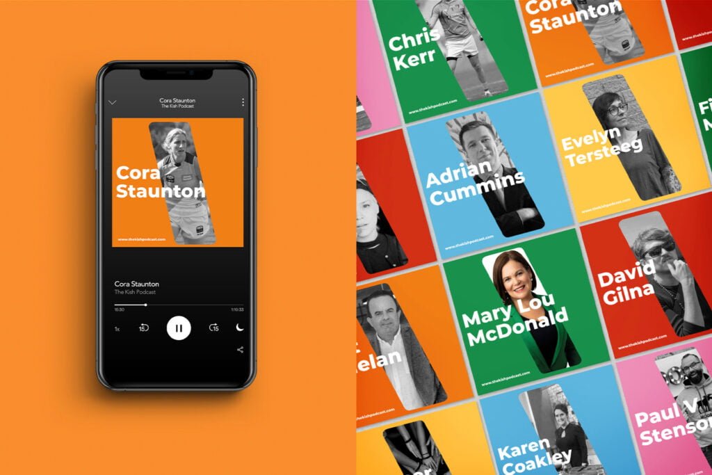
Branding for The Kish Podcast. The name of the podcast is inspired by Kish Bank Lighthouse, Ireland. It was a very important part of the design process to included the unique shape of the lighthouses info the logo. Also, the logo needs to be a type version to be readable, stand out on all streaming platforms.
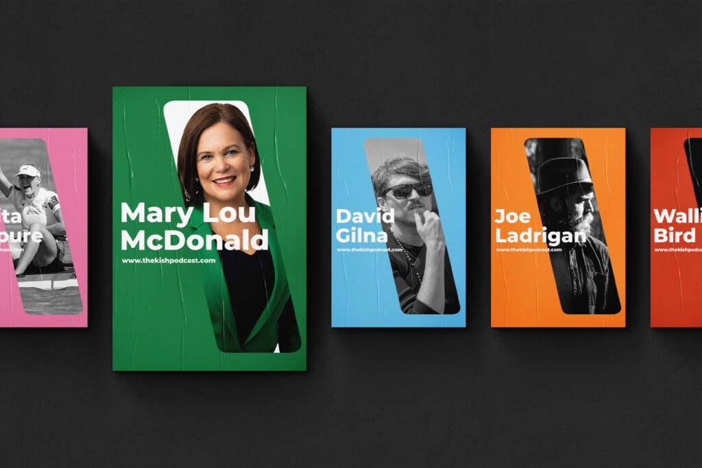
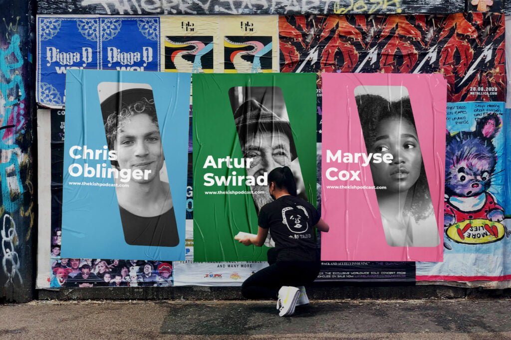
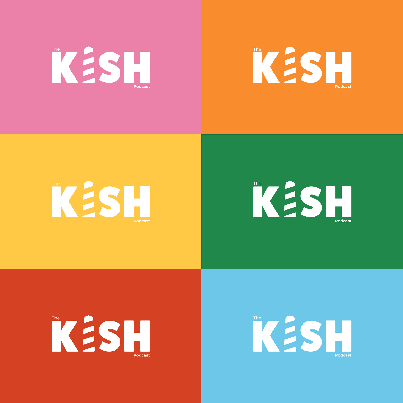
We have added 6 additional colours that are singed to categories of the interviews: Business, Culture, Sports, Art, Public Relationships and Health. Which makes it easier to categorize the episodes and for the audience. Episode Cover has created as a template to fit all. Colours are based chooses based on the topic. Profile image it’s in the shape of the lighthouse from the logo just on a bigger scale. Format it’s in the square for social media posts.
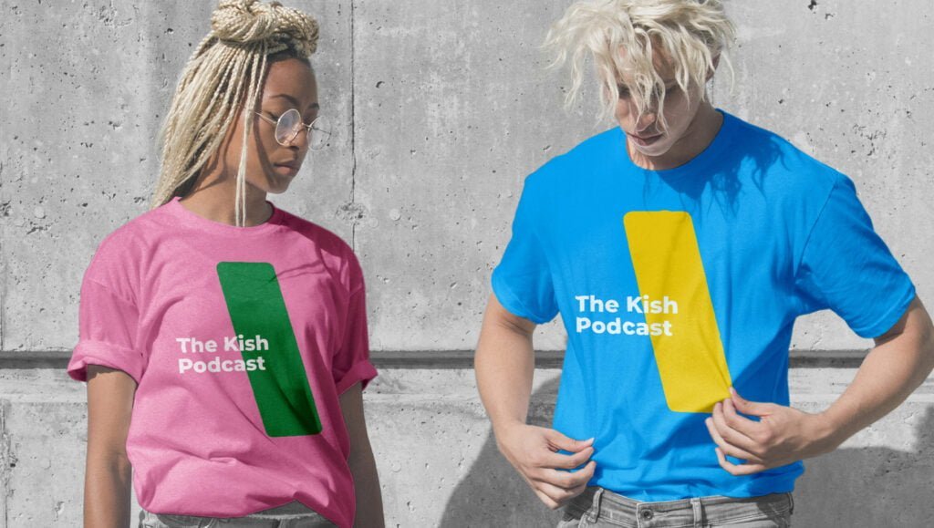
It was great to work on that project and create smooth and practical branding for the podcast, ensuring it checked all the necessary boxes: from designing the Kish Bank Lighthouse logo and crafting the perfect type logo to creating an eye-catching episode cover and planning engaging social media content. We also brainstormed some future branding gear that aligns with our vision. This comprehensive approach felt akin to hitting a jackpot at the Slot Monster Casino where every spin brings excitement and potential rewards—much like every creative decision in this project led to a polished final product.
Client
The Kish Podcast
EXPERTISE
- Branding
- Digital Design
- Social Media
- Web Design
THE KISH STORY

